---
version: alpha
name: Roots & Fruit
description: >-
  Core Design System (CDS) agent contract for Roots & Fruit visual identity.
  Use for marketing pages, product UI, plugin surfaces, and as the token source
  for the presentation layer (PDS / rf-reveal) that sits on top of CDS. Prefer
  CSS variables in css/tokens.css (--rf-*) when implementing in this repo.
colors:
  primary: "#62744d"
  primary-deep: "#4b5e2e"
  primary-soft: "#e4eadc"
  secondary: "#6b6560"
  tertiary: "#d4844e"
  tertiary-soft: "#f0d5c0"
  neutral: "#faf6ee"
  neutral-deep: "#f3ede2"
  surface: "#ffffff"
  panel: "#ebe4d8"
  panel-deep: "#dfd6c6"
  panel-soft: "#f3ece2"
  ink: "#2c2922"
  ink-deep: "#1a1a1a"
  ink-soft: "#9a948c"
  brown: "#40352a"
  rule: "rgba(44, 41, 34, 0.14)"
  info: "#1a5276"
  info-soft: "#d6e6f2"
  blue-muted: "#b8d0e4"
  danger: "#ad3a22"
  danger-soft: "#f7e4dc"
  on-primary: "#ffffff"
  on-info: "#ffffff"
  on-tertiary: "#1a1a1a"
  blue-nav: "#2a5f8f"
  blue-mid: "#245f8c"
  surface-dark: "#4b5e2e"
  on-dark: "#ffffff"
  on-dark-muted: "rgba(255, 255, 255, 0.78)"
  code-bg: "#f3ece2"
  code-fg: "#3d5c4e"
  code-border: "rgba(44, 41, 34, 0.12)"
  code-label-border: "rgba(44, 41, 34, 0.28)"
  code-meta: "#9a948c"
  green-1: "#c5d4b8"
  green-2: "#9aaf86"
  green-3: "#7a9268"
  green-5: "#4a5a38"
  green-6: "#2f3a24"
typography:
  display-xl:
    fontFamily: Knile, Georgia, Times New Roman, serif
    fontSize: 3.5rem
    fontWeight: 700
    lineHeight: 1.1
    letterSpacing: -0.02em
  display-lg:
    fontFamily: Knile, Georgia, Times New Roman, serif
    fontSize: 3rem
    fontWeight: 700
    lineHeight: 1.1
    letterSpacing: -0.02em
  display-md:
    fontFamily: Knile, Georgia, Times New Roman, serif
    fontSize: 2.25rem
    fontWeight: 700
    lineHeight: 1.1
    letterSpacing: -0.02em
  display-sm:
    fontFamily: Knile, Georgia, Times New Roman, serif
    fontSize: 1.75rem
    fontWeight: 600
    lineHeight: 1.15
    letterSpacing: -0.02em
  body-lg:
    fontFamily: Nunito Sans, system-ui, sans-serif
    fontSize: 1.375rem
    fontWeight: 400
    lineHeight: 1.65
  body-md:
    fontFamily: Nunito Sans, system-ui, sans-serif
    fontSize: 1.125rem
    fontWeight: 400
    lineHeight: 1.65
  body-sm:
    fontFamily: Nunito Sans, system-ui, sans-serif
    fontSize: 1rem
    fontWeight: 400
    lineHeight: 1.5
  label:
    fontFamily: Nunito Sans, system-ui, sans-serif
    fontSize: 1rem
    fontWeight: 600
    lineHeight: 1.35
  meta:
    fontFamily: Nunito Sans, system-ui, sans-serif
    fontSize: 1rem
    fontWeight: 700
    lineHeight: 1.35
    letterSpacing: 0.06em
rounded:
  sm: 0.55rem
  md: 0.75rem
  lg: 1.25rem
  pill: 999px
spacing:
  1: 0.25rem
  2: 0.5rem
  3: 0.75rem
  4: 1rem
  5: 1.5rem
  6: 2.25rem
  7: 3.375rem
  8: 5.0625rem
components:
  page:
    backgroundColor: "{colors.neutral}"
    textColor: "{colors.ink}"
    typography: "{typography.body-md}"
  heading:
    textColor: "{colors.ink-deep}"
    typography: "{typography.display-md}"
  subhead:
    textColor: "{colors.primary}"
    typography: "{typography.display-sm}"
  body:
    textColor: "{colors.ink}"
    typography: "{typography.body-md}"
  muted:
    textColor: "{colors.secondary}"
    typography: "{typography.body-sm}"
  link:
    textColor: "{colors.primary}"
    typography: "{typography.label}"
  button-primary:
    backgroundColor: "{colors.primary}"
    textColor: "{colors.on-primary}"
    rounded: "{rounded.pill}"
    padding: 0.7rem 1.15rem
    typography: "{typography.label}"
  button-primary-hover:
    backgroundColor: "{colors.primary-deep}"
    textColor: "{colors.on-primary}"
  button-secondary:
    backgroundColor: "{colors.panel}"
    textColor: "{colors.ink}"
    rounded: "{rounded.pill}"
    padding: 0.7rem 1.15rem
  button-tertiary:
    backgroundColor: "transparent"
    textColor: "{colors.primary}"
    rounded: "{rounded.pill}"
    padding: 0.7rem 1.15rem
  button-cta:
    backgroundColor: "{colors.tertiary}"
    textColor: "{colors.ink-deep}"
    rounded: "{rounded.pill}"
    padding: 0.7rem 1.15rem
  button-ghost:
    backgroundColor: "transparent"
    textColor: "{colors.secondary}"
    rounded: "{rounded.pill}"
    padding: 0.45rem 0.65rem
  button-sm:
    rounded: "{rounded.pill}"
    padding: 0.28rem 0.7rem
    # 14px control label — denser than body-sm; not a type-scale step
  button-product:
    backgroundColor: "{colors.blue-nav}"
    textColor: "{colors.on-info}"
    rounded: "{rounded.pill}"
    padding: 0.7rem 1.15rem
    typography: "{typography.label}"
  button-product-quiet:
    backgroundColor: "{colors.surface}"
    textColor: "{colors.secondary}"
    rounded: "{rounded.pill}"
    padding: 0.7rem 1.15rem
  input:
    backgroundColor: "{colors.surface}"
    textColor: "{colors.ink}"
    rounded: "{rounded.sm}"
    padding: 0.65rem 0.8rem
    typography: "{typography.body-md}"
  surface:
    backgroundColor: "{colors.surface}"
    textColor: "{colors.ink}"
    rounded: "{rounded.md}"
    padding: 1.5rem
  surface-panel:
    backgroundColor: "{colors.panel}"
    textColor: "{colors.ink}"
    rounded: "{rounded.md}"
    padding: 1.5rem
  alert-info:
    backgroundColor: "{colors.info-soft}"
    textColor: "{colors.ink}"
    rounded: "{rounded.md}"
    padding: 0.75rem 1rem
  alert-success:
    backgroundColor: "{colors.primary-soft}"
    textColor: "{colors.ink}"
    rounded: "{rounded.md}"
    padding: 0.75rem 1rem
  alert-warning:
    backgroundColor: "{colors.tertiary-soft}"
    textColor: "{colors.brown}"
    rounded: "{rounded.md}"
    padding: 0.75rem 1rem
  alert-danger:
    backgroundColor: "{colors.danger-soft}"
    textColor: "{colors.danger}"
    rounded: "{rounded.md}"
    padding: 0.75rem 1rem
  alert-note:
    backgroundColor: "{colors.panel-soft}"
    textColor: "{colors.ink}"
    rounded: "{rounded.sm}"
    padding: 1.5rem
  pill:
    backgroundColor: "{colors.panel}"
    textColor: "{colors.ink}"
    rounded: "{rounded.pill}"
    padding: 0.25rem 0.65rem
    typography: "{typography.meta}"
  pill-active:
    backgroundColor: "{colors.primary-soft}"
    textColor: "{colors.primary-deep}"
    rounded: "{rounded.pill}"
    padding: 0.25rem 0.65rem
  surface-dark:
    backgroundColor: "{colors.surface-dark}"
    textColor: "{colors.on-dark}"
    rounded: "{rounded.md}"
    padding: 1.5rem
  takeaways-title:
    textColor: "{colors.primary}"
    typography: "{typography.display-sm}"
  takeaways-item:
    textColor: "{colors.ink}"
    typography: "{typography.body-sm}"
  takeaways-num:
    textColor: "{colors.tertiary}"
    typography: "{typography.label}"
  code-inline:
    backgroundColor: "{colors.code-bg}"
    textColor: "{colors.code-fg}"
    rounded: "{rounded.sm}"
    padding: 0.08em 0.35em
  code-inline-label:
    backgroundColor: "{colors.code-bg}"
    textColor: "{colors.code-fg}"
    borderColor: "{colors.code-label-border}"
    rounded: "{rounded.sm}"
    padding: 0.1em 0.45em
  code-block:
    backgroundColor: "{colors.code-bg}"
    textColor: "{colors.code-fg}"
    rounded: "{rounded.md}"
    padding: 1rem
---

## Overview

Roots & Fruit is Matt Cromwell’s practice for WordPress operators and product teams: clear strategy, practical systems, and work that holds up in the real world. The tone is earned and calm—craft over hype.

Visual identity feels like warm paper and moss: cream canvas, warm ink, Knile for voice, Nunito Sans for clarity, moss green as the steady accent.

Agents must treat this file as normative for any new UI, page, slide, dashboard, or plugin surface. When this repo already ships CSS under `css/tokens.css` and `css/components.css`, map tokens here to `--rf-*` custom properties instead of inventing parallel values. The human reference is `index.html` (Overview leads with who we are, then how to use the system).

Brand feel (always):
- Warm cream paper, not cool gray or pure white as the default page wash
- Soft, organic, grounded; never cyberpunk, glassmorphism, or neon
- One primary interactive accent (moss green); orange is rare and intentional
- Air over density; prefer an extra section or slide over crowding

Use cases this system must serve equally well:
1. Marketing / website pages
2. Presentations and client decks
3. Product UI (boards, forms, dashboards)
4. Compact plugin or admin chrome

## Colors

Semantic roles (use these names in reasoning; hex values are in front matter):

| Role | Token | Hex | Use |
| --- | --- | --- | --- |
| Page wash | `neutral` | `#faf6ee` | Default page/background |
| Wash deep | `neutral-deep` | `#f3ede2` | Alternate bands on cream |
| Surface | `surface` | `#ffffff` | Cards, inputs, lifted modules |
| Panel | `panel` | `#ebe4d8` | Warm grouping without heavy shadow |
| Ink | `ink` | `#2c2922` | Body text on cream/white |
| Ink deep | `ink-deep` | `#1a1a1a` | Headings |
| Secondary | `secondary` | `#6b6560` | Captions, meta, helper text |
| Soft ink | `ink-soft` | `#9a948c` | Disabled-adjacent meta only |
| Primary | `primary` | `#62744d` | Links, primary buttons, accent subheads |
| Primary deep | `primary-deep` | `#4b5e2e` | Primary hover / pressed |
| Primary soft | `primary-soft` | `#e4eadc` | Soft fills, success wash, chips |
| Tertiary | `tertiary` | `#d4844e` | Rare CTA only (one per view max); takeaway rules / numbers |
| Surface dark | `surface-dark` | `#4b5e2e` | Dark callout cards and article hero bands |
| On dark | `on-dark` | `#ffffff` | Titles on `surface-dark` |
| Code bg | `code-bg` | `#f3ece2` | Inline and block code paper |
| Code fg | `code-fg` | `#3d5c4e` | Default monospace / syntax base (moss-teal) |
| Code label border | `code-label-border` | `rgba(44, 41, 34, 0.28)` | Outline for `.inline-label` / `.rf-inline-label` |
| Info | `info` | `#1a5276` | Product nav / informational UI only |
| Danger | `danger` | `#ad3a22` | Errors and destructive states (brick, not fire-engine — stays in the warm family) |

Rules:
- Default stack: `neutral` background + `ink` / `ink-deep` text + `primary` for interaction
- Marketing surfaces usually omit `info` blue; product UI may use it for nav and info alerts
- Never promote `tertiary` (orange) into a second brand theme or large background fills
- Before shipping text-on-color pairs, require WCAG AA (4.5:1) for body text; AA large (3:1) only for Knile headings / big stats
- Safe defaults: `ink` or `ink-deep` on `neutral`, `neutral-deep`, `surface`, `panel`, `primary-soft`; `on-primary` on `primary` / `primary-deep`; `on-tertiary` (`ink-deep`) on `tertiary` for CTA fills — never white on orange

Green scale (`green-1` … `green-6`) is for charts, illustrations, and progressive emphasis, not random decoration.

## Typography

Three families only:
- **Knile** (serif): display, titles, section headers, accent subheads. Tracking `--rf-tracking-display` (`-0.02em`). Upright weights 400 / 600 / 700 only (WOFF2s hosted on rootsandfruit.com; see `css/fonts.css`). **No italic faces** — do not synthesize Knile italic.
- **Nunito Sans** (sans): body, UI labels, tables, forms, meta. High x-height: body leading `1.65`. Weights 400 / 600 / 700, each with a true italic.
- **JetBrains Mono** (or system mono stack): code only. Never use mono for marketing body copy.

Size scale (CSS `--rf-text-*`; **no `xs`**):

| Token | Size | Role |
| --- | --- | --- |
| `sm` | 16px (`1rem`) | Floor. Compact UI, labels, meta, table cells |
| `md` | 18px (`1.125rem`) | Default body and long-form (`.rf-prose`, ledes) |
| `lg` | 22px (`1.375rem`) | Short lead / intro emphasis |
| `xl` | 28px (`1.75rem`) | Display sm (Knile subhead) |
| `2xl` | 36px (`2.25rem`) | Display md |
| `3xl` | 48px (`3rem`) | Display lg |
| `4xl` | 56px (`3.5rem`) | Display xl |

### Line-height

| Token | Value | Use |
| --- | --- | --- |
| `--rf-leading-display` | 1.1 | Knile `2xl`–`4xl` |
| `--rf-leading-snug` | 1.15 | Knile `xl` / short titles |
| `--rf-leading-body` | 1.65 | Nunito `md` / `lg` |
| `--rf-leading-callout` | 1.55 | Notes, alerts, contained copy |
| `--rf-leading-ui` | 1.35 | Nunito `sm` |

### Weights

| Token | Value | Typical use |
| --- | --- | --- |
| `--rf-weight-regular` | 400 | Nunito body; Knile regular rarely on screen |
| `--rf-weight-semibold` | 600 | Labels, buttons, Knile accent subheads |
| `--rf-weight-bold` | 700 | Knile display titles; Nunito meta / strong stress |

Do not introduce 500 or 800. Prefer semibold before bold for UI chrome.

### Italic

- **Nunito:** use `<em>` / `font-style: italic` for short inline emphasis in body; regular italic is the default stress. Semibold/bold italic are available but rare.
- **Knile:** upright only. For title emphasis, change weight or color — never fake an oblique.
- Do not italicize whole marketing heroes.

### Spacing around type

- Display title → following lead: at least `--rf-space-5` below the title (docs default).
- Body paragraphs: `.rf-prose` paragraph gap `--rf-space-5`, or a parent `.rf-stack`.
- Meta eyebrow → title: tight (`space-2`–`space-3`); large air belongs *under* the title.
- Measure: `--rf-measure` (`60ch`) on reading lines for articles and marketing; tracking meta `--rf-tracking-meta` (`0.06em`) for uppercase eyebrows.
- Analytical HTML reports (`rf-html-report`): use `.rf-prose--wide` (or report `.prose-block`) at `--rf-measure-report` (`64ch`) and `body-lg` (`--rf-text-lg`). Larger type makes each `ch` wider, so the measured column fills more of the shell without abandoning measure.
- Tool/product UI: prefer `--rf-content-max` for the shared column; do not nest article measure inside a wider card.
- Do not mix ad-hoc vertical margins with `.rf-stack` gap on the same children.

Roles:
- `display-*` = Knile hierarchy (xl → sm) with display/snug leading
- `body-lg` = short lead (`--rf-text-lg`); also report narrative with `--rf-measure-report`
- `body-md` = default reading (`--rf-text-md`)
- `body-sm` / `label` / `meta` = compact UI at `sm` (16px)
- `meta` = uppercase eyebrows at `sm` + bold + meta tracking

Optical rules (size scales alone will not fix these):
- Constrain reading columns with a `ch` measure, not only the layout shell (`--rf-max`)
- Use `.rf-prose` for long-form articles: `--rf-measure` (`60ch`) + `body-md` + body leading
- Use `.rf-prose--wide` in analytical reports: `--rf-measure-report` (`64ch`) + `body-lg` so narrative feels balanced next to full-shell tables
- Inside callouts, use `--rf-leading-callout` and generous padding
- Do not rely on fluid viewport type alone to “fix” readability
- Do not drop measure to “full shell” for report prose; widen measure and type instead

Rules:
- Do not introduce Inter, Roboto, Arial, system-ui-only stacks, or a third display font
- Do not put Knile on long paragraphs
- Do not put Nunito Sans on the primary page title when Knile is available
- Prefer sentence case; never force all-caps on Knile display titles (meta uppercase is allowed for eyebrows only)
- If Knile webfonts are unavailable, fall back to Georgia / Times New Roman; still declare Knile first
- Do not use a size below `sm` (16px). There is no `xs` token
- Do not synthesize Knile italic; do not invent weights outside 400 / 600 / 700

## Layout

Principles drawn from *Every Layout* (Pickering & Bell): clarity and stability come from a few axioms and composable primitives, not from hard-coded breakpoints for every block. Do not invent one-off spacing like `13px` or `22px`.

### Axioms

- **Measure:** no line of narrative text should exceed its measure token. Use `ch`, never a fixed `px` width, so measure tracks font-size. Articles and marketing use `--rf-measure` (`60ch`). Analytical HTML reports use `--rf-measure-report` (`64ch`) at `body-lg` so the column is physically wider next to full-shell tables while staying measure-constrained. Structural shells (`html`, `body`, `main`, nav, generic wrappers) are not capped by measure.
- **Tool / product columns:** dashboards and task UIs (Phloem, plugin chrome) use a shared content shell `--rf-content-max` (`52rem`) so title, chrome, and body share one right edge. Do **not** nest `--rf-measure` on paragraphs inside a wider surface of the same component (that pinches copy next to full-width cards). Prefer shell-led width for tools; keep `ch` measure for article and report prose.
- **Suggestion over prescription:** prefer `max-inline-size`, `min-block-size`, `gap`, and `flex-basis` over fixed `width`/`height`. Avoid data loss from overflow.
- **One space ratio:** `--rf-ratio` (`1.5`) seeds modular space from `1rem` (`spacing.4` / s0). Larger steps (`5`–`8`) multiply by the ratio. Fine UI steps `1`–`3` stay below s0 for chrome only.
- **Boxes:** global `border-box`; logical properties (`margin-block`, `padding-inline`, `max-inline-size`); reading columns may use `content-box` so `ch` measures text, not padding. See also [Every Layout · Boxes](https://every-layout.dev/rudiments/boxes/).

### Primitives (`css/layouts.css`)

| Class | Job |
| --- | --- |
| `.rf-stack` | Vertical rhythm via `gap` (default `spacing.5`). Variants: `--sm`, `--md`, `--lg`. Child block margins reset so gap owns the rhythm. |
| `.rf-center` | Centered column at `--rf-measure`. Optional `.rf-center--gutter` for inline padding. |
| `.rf-cluster` | Wrapping horizontal group (buttons, pills) with even `gap`. |
| `.rf-prose` | Long-form type + measure (see Typography). |
| `.rf-prose--wide` | Report long-form: `--rf-measure-report` (`64ch`) + `body-lg`. Wider measured column for analytical HTML reports; not the default for marketing articles. |

Shell / product chrome may still use grids and sidebars (this docs page’s `.ds-shell` is a sidebar composition). Prefer Stack + Center for article-like content.

Hierarchy:
- One job per section: one heading, one short supporting line, then content
- Prefer `.rf-stack` (or `spacing.5`–`spacing.7` gaps) between major blocks
- Heading margin below should usually be larger than the gap into the following paragraph
- Avoid dashboard clutter on brand/marketing surfaces (no stat strips, pill clusters, or competing callout stacks in the first viewport)

Page shell:
- `--rf-max` (~56rem) may wrap sidebars and specimens; article paragraphs obey `--rf-measure`
- `--rf-content-max` (~52rem) wraps tool/product reading columns (task detail, similar app views) when chrome and prose should share one edge
- Analytical reports: body prose uses `.rf-prose--wide` (`64ch` + `body-lg`); tables and charts may still span the full shell
- Marketing heroes may go full-bleed for atmosphere; text blocks keep measure

Breakpoints (practical defaults):
- Compact: below ~800px, collapse sidebars, stack columns, keep tap targets pill-button sized
- Comfortable: 800px+
- Prefer intrinsic layouts (Stack, Cluster, Center) over adding many width breakpoints

## Elevation & Depth

Depth is quiet.
- Default surfaces: 1px `rule` border, optional light shadow `0 2px 12px rgba(44, 41, 34, 0.06)`
- Stronger lift only when needed: `0 8px 28px rgba(44, 41, 34, 0.1)`
- Prefer border + background shift (`surface` / `panel` / `neutral-deep`) over stacked shadows
- No neon glow, no multi-layer colored shadows, no glass blur as a brand device

## Shapes

Corner radii:
- `rounded.sm` (0.55rem): inputs, small controls
- `rounded.md` (0.75rem): surfaces, alerts, tiles
- `rounded.lg` (1.25rem): large media frames when needed
- `rounded.pill` (999px): buttons, pills, chips

Buttons are pills by default. Do not mix sharp 0-radius chrome with pill buttons in the same view unless documenting a deliberate exception.

Chart / meta accents (shared with presentations): `--rf-orange-deep` for meta text; `--rf-chart-1`…`--rf-chart-4` (green-deep · orange · blue · brown) for multi-series charts. Do not build segments from adjacent soft greens. HTML report bar geometry (single series vs paired dual-metric rows; never two series on one baseline) is owned by the `rf-html-report` skill, not by these tokens.

Focus ring: soft green halo (`0 0 0 3px` color-mix of primary at ~35% opacity). Never remove focus styles.

## Components

Implement with these behaviors. Class names in this repo: `.btn`, `.input`, `.surface`, `.alert` (including `.alert--note`), `.pill`, `.rf-disclosure`, plus layout primitives `.rf-stack` / `.rf-center` / `.rf-cluster` / `.rf-prose` (see `css/components.css`, `css/disclosure.css`, `css/layouts.css`).

**Buttons**
- `button-primary` (`.btn--primary`): default main action (moss). One primary per section/view on marketing or mixed surfaces.
- `button-secondary`: warm panel fill for secondary actions.
- `button-tertiary`: outlined green for low-emphasis actions.
- `button-cta`: orange fill with dark ink text for contrast; at most one high-stakes CTA on a view (Book, Pay, Submit final). Do not use white text on orange. Hover lightens toward cream (`85%` orange / `15%` cream) so contrast improves; do not darken with brown.
- `button-ghost`: text-like dismissal / tertiary navigation.
- `button-sm` (`.btn--sm`): compact control size for cards, toolbars, and download rows. Compose with a color variant (e.g. `.btn--tertiary.btn--sm`). Keeps the pill radius; uses denser padding and a 14px control label (not a new body type-scale step — still no `xs` in the type ramp).
- `button-product` (`.btn--product`): **product UI only** — filled info blue (`blue-nav`) with white text. Use for selected app nav, board switches, and primary in-tool actions inside dashboards (Phloem, plugin chrome, ops boards). Signals “you’re in the product,” not a marketing pitch. Do not use on marketing heroes or as a brand CTA.
- `button-product-quiet` (`.btn--product-quiet`): idle product nav chrome (white + soft border). Hover tints toward info blue; selected state uses `aria-current="page"`, `aria-pressed="true"`, or `.is-active` and matches `button-product` fill.
- In a product nav cluster, prefer quiet siblings + one current product fill — not a row of filled blue buttons.
- Disabled: reduce opacity; do not invent a gray system.

**Links**
- Marketing / long-form: `primary` green, semibold when inline. Never default browser blue.
- Product UI title links may use `info` blue (as in Phloem task titles); do not use that blue for marketing body links.

**Forms**
- Labels above fields (`typography.label`)
- Inputs: white surface, soft ink border, `rounded.sm`, green focus ring
- Errors: danger border + text message under the field (never color-only)
- Selected choice chips / toggles: use `pill-active` (`.pill--active` or `.pill.is-active`) — `primary-soft` fill with `primary-deep` text. Do not use solid `primary` with `ink` (fails contrast). Solid `primary` fills must use `on-primary` (white).

**Pills**
- Default `.pill`: panel fill + ink
- `.pill--active` / `.pill.is-active`: selected state (`pill-active` in front matter)
- `.pill--green`: same soft-green recipe as active (status “success / in play”)
- Pills are **single-line chips**: `white-space: nowrap` and `flex-shrink: 0` (see `elements.css`). Keep labels short (about 1–3 words or a compact metric). In flex headers next to titles, allow the row to wrap (`flex-wrap: wrap`) so a tight card moves the pill below as a full chip instead of squeezing it into a tall oval.
- Filled moss buttons use `on-primary`, not bare `ink`

**Surfaces**
- `surface`: white module on cream
- `surface-panel`: warm panel grouping without heavy card shadow
- Cream-deep bands for alternating page sections
- `surface-dark` (`.surface--dark`): moss-deep callout on cream pages; white titles, muted white body; CTAs use `button-cta` with `ink-deep` on orange (not white on orange). Prefer one dark card per sidebar or section.
- Do not wrap every block in a shadowed card

**Key takeaways** (`.rf-takeaways` / `ol.rf-keytakeaways`)
- Knile title in `primary` green (“Key Takeaways”)
- Ordered items with 2px `tertiary` left rule, zero-padded numbers (`01`, `02`) in orange, body in `ink`
- Optional lead line: `<strong>` as the first child of each `li` (renders as a block title above the body). Do not put title and body in separate grid columns.
- Use in article sidebars or after the intro; keep to a short list (about 3–5 items)
- Do not restyle as bullets, pills, or icon rows

**Tables** (`.table-wrap` + `table.rf-table`)
- Every `th` and `td` is **left-aligned** (see `elements.css`). Do not right-align numeric columns (volume, CPC, counts) in R&F analytical reports or brand UI unless a product surface explicitly needs accounting-style columns.

**Code**
- Inline `code` (quiet): warm `code-bg`, moss-teal `code-fg`, **no border** — for terms in sentence flow (`write-a-skill`, short flags)
- Inline label (`.inline-label` / `.rf-inline-label`): same paper + `code-fg`, **outlined** with `code-label-border` — for named objects (files, paths: `SKILL.md`). Prefer this when the token is a thing the reader should clock as a label, not a slip of code in prose
- Do not use both chromes on the same string; do not outline every `<code>` by default
- Block `.rf-code`: same paper fill; optional window dots + copy control + language meta (matches the site’s Code Block Pro chrome). Soft-wrap long lines (`pre-wrap`); do not use horizontal scrollbars in snippets
- Keep the window chrome; retune syntax base to `code-fg` / warm Solarized-light on `code-bg` rather than cool cyan on gray
- One language label in `code-meta`; do not add neon terminal themes

**Feedback**
- Pills for compact status
- Alerts for full-sentence page messages (`alert-info`, `alert-success`, `alert-warning`, `alert-danger`)
- `alert-note` (`.alert--note`): instructional how-to / guidance on `panel-soft` with a moss left rule — not a status message
- Spinner for indeterminate wait; progress bar only when percent is known

**Disclosure** (`.rf-disclosure` in `css/disclosure.css`)
- One expandable section via native `<details>` / `<summary>` (a11y name: disclosure). Prefer this over custom accordion JS for a single panel.
- Closed: bordered white box, meta-style uppercase label, leaf caret pointing right
- Open: cream panel with generous padding; leaf rotates to point down
- Summary label uses meta tracking; slight size nudge on hover / open is allowed
- Leaf mark: `icons/leaf-arrow.svg` (Streamline Sharp geometry, CC BY 4.0, CDS greens). Tip is top-right at rest; CSS rotates +45° (closed → right) and +135° (open → down). Not the tree wordmark.
- Use for secondary background (context, sources, footnotes) that should stay out of the way. Do not hide the primary action or completion test behind a disclosure.
- An “accordion” (coordinated group, one-open-at-a-time) is out of scope for this primitive; stack independent `.rf-disclosure` elements when several sections collapse.

**Brand assets (non-token but mandatory)**
- Wordmark vs tree icon: wordmark when naming the brand; tree icon for favicons, avatars, tight badges
- **Default wordmark (hard stop):** when Matt says “the logo,” “full logo,” “full wordmark,” “R&F logo,” or similar without naming a variant, use **`logos/SVG/R&F_Logo.svg`** — the multi-tone full-color canopy on cream/light. On dark fields, default to **`logos/SVG/R&F_Logo_DarkBG.svg`**. Do **not** default to `*_Flat_Color_*` (mono moss / simplified) or flat black/white. Flat / mono variants only when he explicitly asks for flat, mono, one-color, or small-size simplification.
- UI caret leaf: `icons/leaf-arrow.svg` for disclosures and similar expand/collapse chrome (see Disclosure)
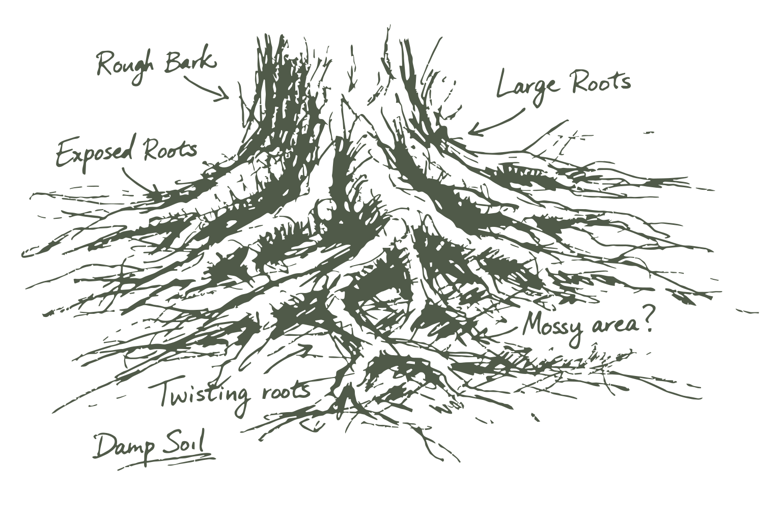
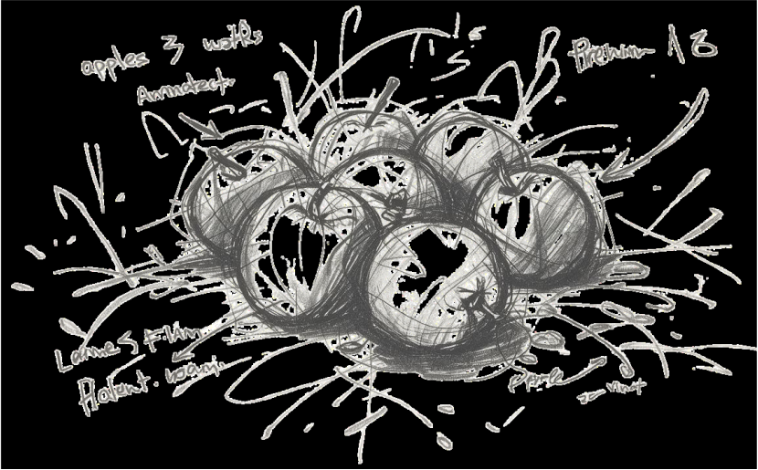
- Illustrations (`illustrations/roots-1.svg`, `illustrations/apples-1.svg`): atmosphere only. Use tokens `--rf-atmosphere` (≈0.10), `--rf-atmosphere-quiet` (≈0.065 under dense title/hero text), `--rf-atmosphere-spot` (≈0.45 for apples). Utilities: `.rf-atmosphere`, `.rf-atmosphere--quiet`, `.rf-atmosphere--spot`. When small copy sits on roots, prefer `.rf-lede-over-atmosphere` (Nunito 600 + `--rf-ink-muted`) before frosting or further dimming art. One watermark per surface. Never treat illustrations as logos or links.
- Prefer SVG for on-screen marks; PNG profile/square exports for host uploads that require raster

**Presentations (PDS layer on CDS)**
- One design system: CDS owns tokens here; the presentation layer (`/rf-reveal`) owns Pitch layouts and reveal.js chrome
- PDS vendors `css/tokens.css` via `sync-cds-tokens.ps1` (`cds-tokens.css`); do not invent parallel hex, opacities, or lede weights in the deck
- Presentations pick a PDS **layout id** first, then compose elements from this package (surfaces, quiet `rf-table`, buttons/pills, `code` / `.inline-label`, `.rf-code`). Element-kit gallery slides are operator QA only — not client layout ids (`/rf-reveal` · `company-docs/03-Marketing (CMO)/social/pds/REFERENCE.md`). Vertical social: open `company-docs/03-Marketing (CMO)/social/AGENTS.md` · templates `…/social/templates/` · forks `…/social/presentations/` · `/rf-shorts-li` · `/rf-shorts-yt`
- Same color/type language; more whitespace; fixed slide canvas is fine
- One atmosphere treatment per slide; do not stack watermarks

## Do's and Don'ts

**Do**
- Start from cream (`neutral`) + ink + moss (`primary`)
- Use Knile for titles and Nunito Sans for reading/UI
- Keep orange (`tertiary`) rare and singular
- Check contrast for body text (AA) before shipping
- Use the spacing and radius scales exactly
- Keep sections simple: one purpose, clear hierarchy
- Reuse `css/rf.css` (or tokens + components) when working in this brand package

**Don't**
- Don't use purple gradients, indigo glow, cool gray glass, or “AI slop” aesthetic defaults
- Don't use Inter, Roboto, Arial, or comic display fonts
- Don't make orange a theme color or page background
- Don't put more than one primary button (or one orange CTA) in a single view
- Don't use pure black (`#000`) or pure white as the default page wash
- Don't invent new hex values when a token exists
- Don't use illustrations as logos, or logos as decorative watermarks at full opacity
- Don't substitute `*_Flat_Color_*` or flat mono wordmarks when “full logo” / default brand mark is requested — use `R&F_Logo.svg` (light) or `R&F_Logo_DarkBG.svg` (dark)
- Don't add drop shadows, outlines, recolors, or stretch transforms to official logo files
- Don't build dense marketing heroes with stats, chip rows, and multiple competing CTAs
- Don't remove focus indicators
- Don't use blue (`info` / `button-product`) as a marketing accent or site-wide primary; reserve it for product/info UI
- Don't mix a moss primary and a filled product button as competing “main” actions in the same cluster
- Don't create a dark-mode palette unless explicitly asked (light cream system is default)
- Don't use cool cyan/gray IDE chrome for code; stay on warm `code-bg` + moss-teal base
- Don't outline every inline `code` (that chrome is for `.inline-label` only); don't use `.inline-label` for ordinary in-flow terms
- Don't put white text on orange CTAs (including on dark cards); use `ink-deep` on `tertiary`
- Don't invent a second takeaways pattern (cards, checkmarks, emoji numbers)
- Don't introduce an `xs` size or any readable text below `sm` (16px)
- Don't invent parallel layout utilities when `.rf-stack`, `.rf-center`, or `.rf-cluster` already fit
- Don't set paragraph measure in `px`; use `--rf-measure` (`ch`)
- Don't nest `--rf-measure` on prose inside a wider tool surface; use `--rf-content-max` for the shared column instead
- Don't hide primary next actions inside `.rf-disclosure`
- Don't fake Knile italic or add font weights outside 400 / 600 / 700
- Don't commit Knile WOFF/WOFF2 binaries to any public GitHub repo (`brand`, `slides`, or forks). Host Knile only on rootsandfruit.com (`/wp-content/uploads/rnf_assets/fonts/`); load via absolute URL in `css/fonts.css` / PDS `tokens.css`. Offline/file opens may fall back to Georgia.

## Agent directives

When generating or editing UI for Roots & Fruit:

1. Read this file before choosing colors, type, radius, or components.
2. Prefer token names and `{colors.*}` references over raw hex in reasoning; emit CSS variables `--rf-*` when editing this repo’s brand CSS.
3. If a request conflicts with Do's and Don'ts, follow this file and note the conflict briefly.
4. Validate text/background pairs against WCAG AA for body copy.
5. After UI changes, self-check: cream paper present? Knile on titles? One primary action? No purple/gray-glass drift? No extra orange?
6. For brand marks and illustrations, use files under `logos/` and `illustrations/`; do not regenerate lookalikes.
7. Unknown patterns (modals, tabs, toasts, dark mode) are out of scope until added here; improvise with existing tokens and keep the same constraints rather than inventing a new visual language.
Markdown